- The problem -
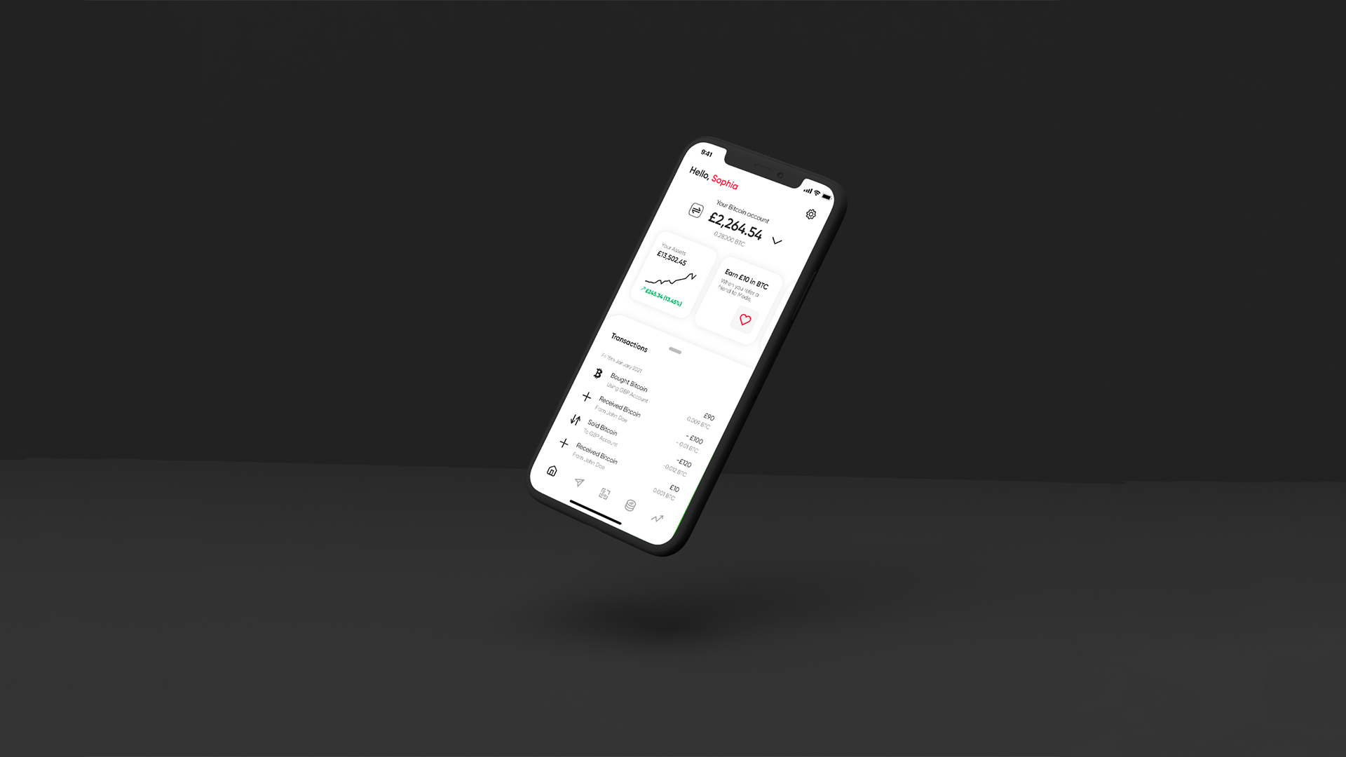
Since our app redesign a number of users had contacted Customer Support to ask about how to use the new dashboard. The majority of people had trouble finding out where they can switch between their Bitcoin and GBP accounts as well as how to top up and use the payment functionality. In the current implementation the user has to click on the little chevron icon to reveal their different account and on the actions icon in order to transact.
- Ideation -
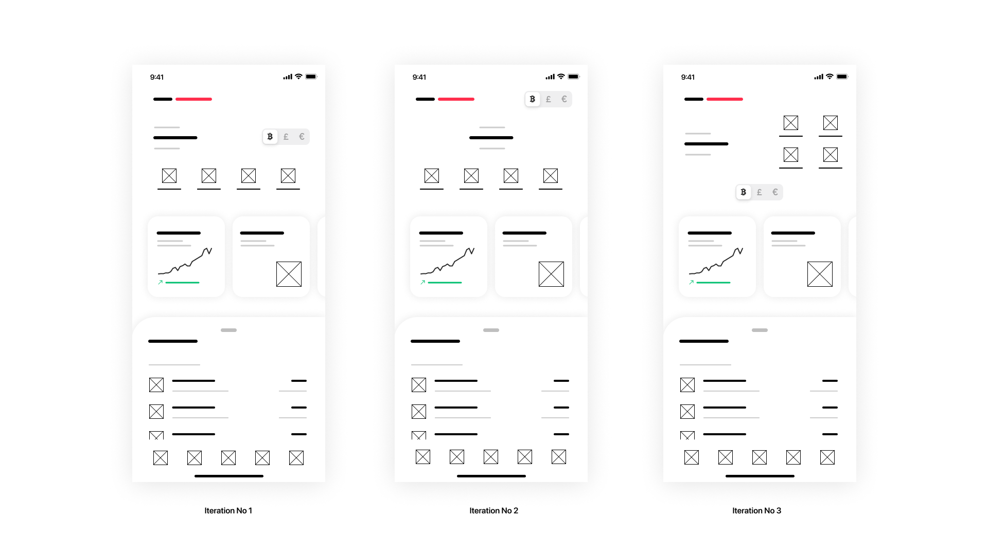
After gathering all the necessary feedback I had to go back to the drawing board and try simplify the account switch flow as well as the way users could perform different actions with their account. I tried a few different variations but as space was very limited and the information on that particular screen can be overwhelming I decided to go with the second iteration.
- The solution -
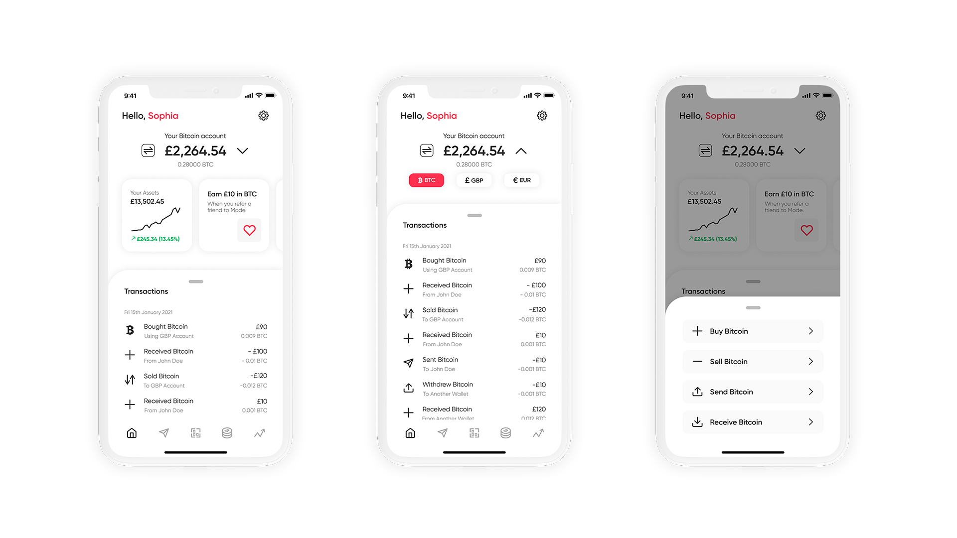
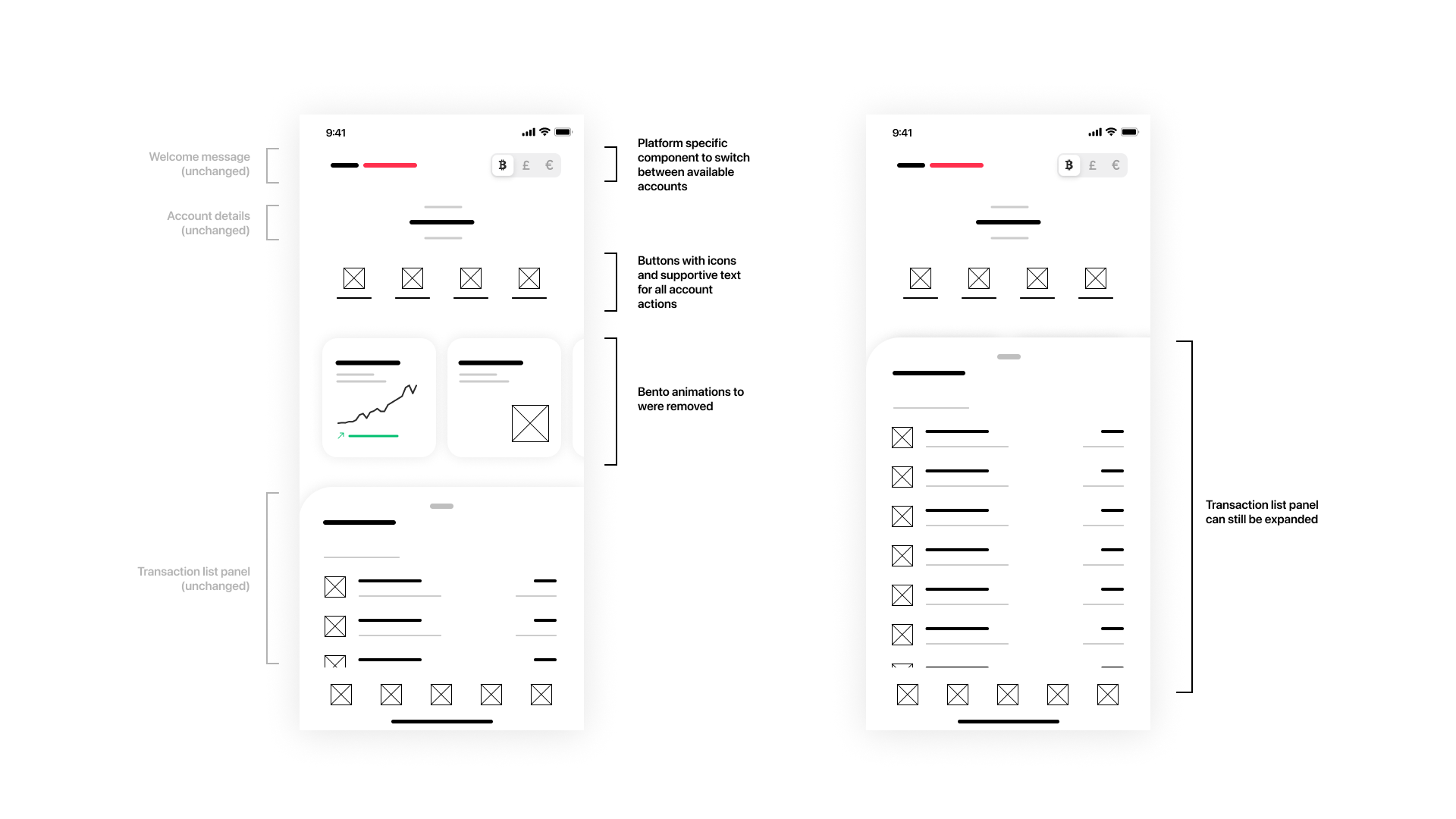
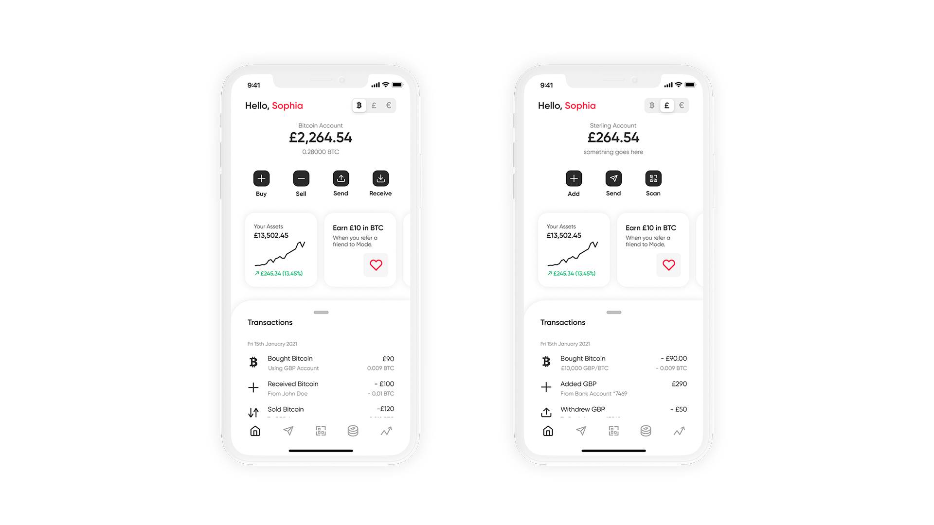
We quickly realised that we would have to change the UI so that people can easily manage their funds as well as see their different balances. Out hypothesis came from the exact action they were wondering how to perform: “Switch accounts”. We used a segmented control to show all accounts at the very top. In addition we moved all the actions for each account on the main dashboard for easier access.
- The Outcome -
After doing the changes we run the same test again and found that user were able to perform all tasks in shorter period of times with far less miss-clicks. The new implementation is under development and should be released in the app soon.
Thanks for reading :)